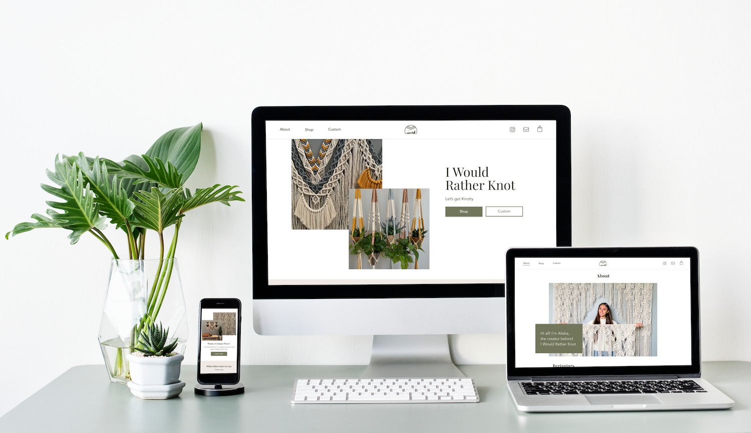
I Would Rather Knot
Designing, branding and building a website using WordPress for a small business that has grown in popularity on Instagram.
Overview
I Would Rather Knot is a small business started in 2017 that sells handmade macrame. The business sells plant hangers and earrings that can be customized by color, and custom-made orders for bigger pieces that are used for weddings and home décor. I Would Rather Knot has grown in popularity on Instagram with over 30K followers. The business does not currently have a website. The owner primarily sells orders through messages received through Instagram, but also sells through Etsy and another home décor online store that takes 50% of each product sold. The owner works hard on making pieces for her customers and wants her own website where she can sell her products without needing to go through a third-party.
Click here to view I Would Rather Knot’s Instagram.
Role
UX/UI Designer and Branding
Project Objective
- Design a logo and branding material with a similar aesthetic to the owner’s Instagram page
- Design a responsive e-commerce website that is easy for her customers to understand and use
- Building the website using WordPress
Challenges
- Creating a clear and concise way to layout the custom ordering process
- Finding and figuring out tools to create the e-commerce website using WordPress that is easy to hand off to the business owner
Process

1. Research
Market Analysis
A market analysis was done for Venmo as the owner expressed wanting to sell using Venmo. Market analysis was also done to gain a better understanding of the current trends and best practices of the industry.
To review the market analysis click here.
Competitive Analysis
It was crucial to review some examples of other popular Instagram artists that have created websites to understand more on what is needed to create the I Would Rather Knot website (i.e. clean layout of different price points with sample pictures for custom-made orders). It was also beneficial to look at the websites where I Would Rather Knot is currently selling items to understand the information and copy that the business had already created.
To review the competitive analysis click here.
User Interviews
I chose to conduct interviews with four participants who had previously purchased items from I Would Rather Knot. The key demographic of the business’s traffic on Instagram are of female users between the ages of 25-34. Thus, the majority of the interviewees were female (3), and all participants were within the key age bracket.
In the interview participants were asked questions about their pervious experiences when shopping for custom-made or handmade products. Then participants were asked specific questions about their experience with ordering with I Would Rather Knot.
Research Insights/Outcomes
- A majority of the participants noted they would shop on a bigger screen, such as their computer, for websites they are unfamiliar with and/or a website that do customizations so they have more screen space to see the product better.
- This insight moved me to design for the desktop version first, instead of my initial thought of designing for mobile first
- Customers liked the back-and-forth communication between them and the owner, expressing that “it felt as if I were a part of the piece created for me”
- Knowing about the owner and reviews help to push users towards making their purchase
If you want to see a more extensive debrief of my interviews please click here.
2. Define
Persona

I Would Rather Knot Persona
A persona was created taking into account the different behaviors, values and concerns the interviewees had. The persona impacted the design decisions and help to focus on the needs of the users. It helped me to empathize with the users as I developed the product.
Storyboard
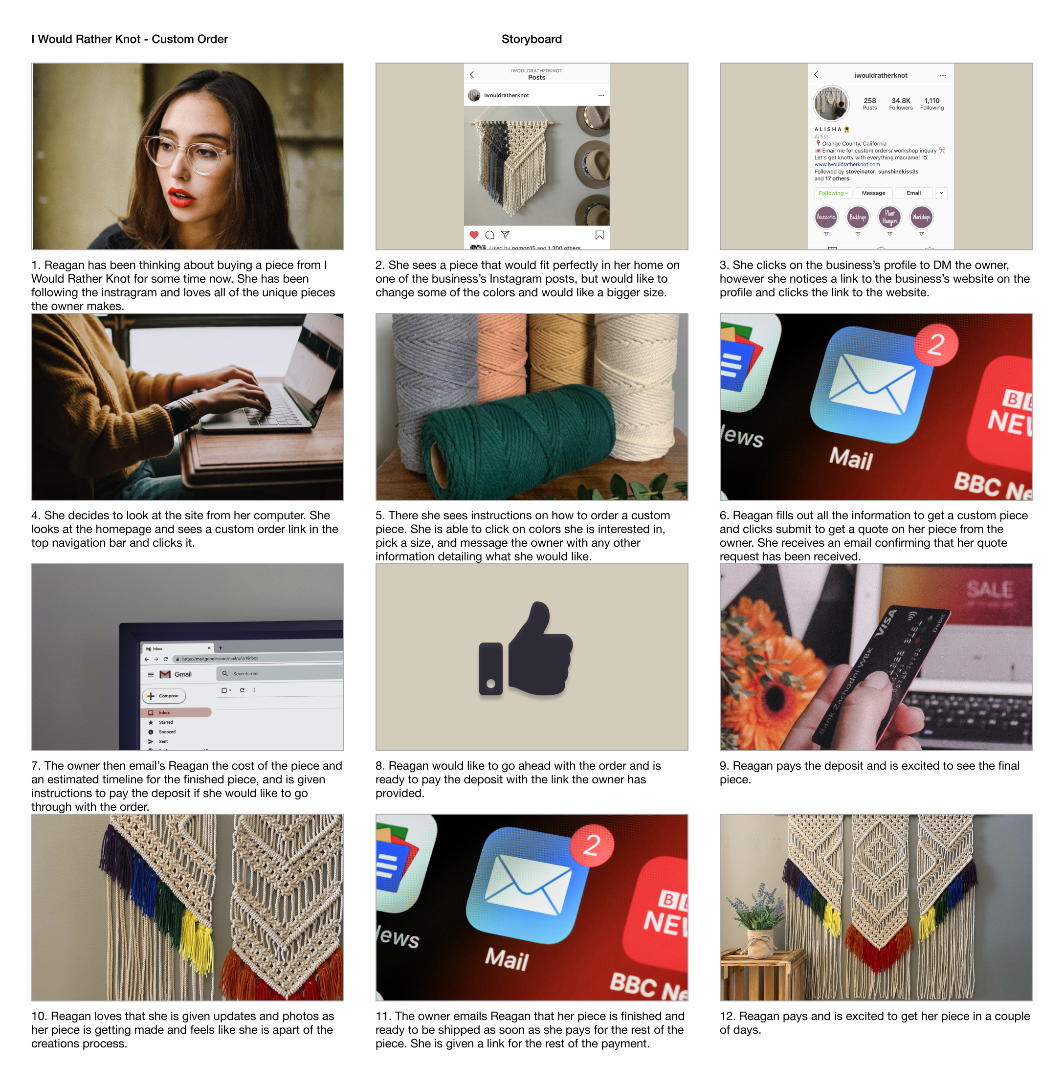
Storyboard for Custom Order
A storyboard was created to gain a better idea of the process customers would have to go through to do a custom order.
Sitemap, Task and User Flows

User Flow
A sitemap was created in order to map out the structure of the site. Task and user flows were made for the custom ordering process and for buying one of I Would Rather Knot’s recurring items. The sitemap, task and user flows helped to visualize the different avenues a customer might take to ordering something as well as helped to understand the pages and actions needed to make the website functional for the customer.
Responsive Wireframes
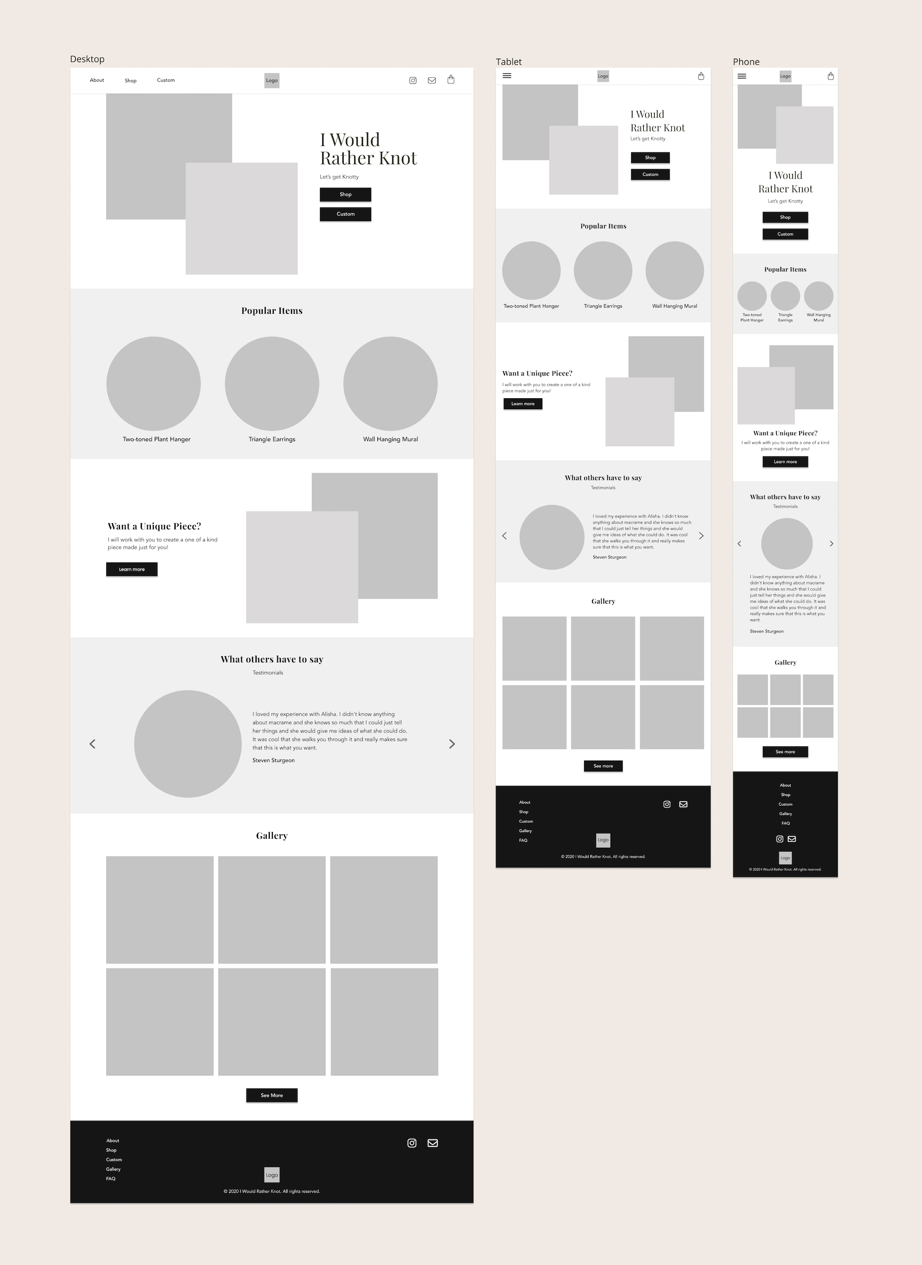
Responsive Wireframes of the Homepage
Building the responsive wireframes enabled me to have an overall picture of how I was going to layout the site. Also, taking into account my research, persona, storyboard, sitemap and flows.
3. Design
Branding Material

UI Kit
I worked with the business owner to come up with branding for the website. Key branding words:
- Boho
- Friendly
- Inspirational
Logo: There was multiple iterations. I sketched out some ideas for the owner and had her pick out a couple for me to design in Figma. From there, the owner showed ideas to several different people to pick out their favorite and selected the one that the majority picked. Then, I made a slight variation to the logo to use for the favicon size.
Typography: Playfair Display and Avenir were the fonts chosen. The Playfair Display gives a nice boho feel to the design.
Colors: Neutral colors were chosen to allow the colors from the owners macrame pieces to stand out. The leafy green color was chosen for the brand color as the owner uses plants to display a lot of her pieces on Instagram.
Images: Images for the website would be kept square to match the Instagram aesthetic the owner wanted, and circles were also used to resemble Instagram stories.
High-Fidelity Responsive UI
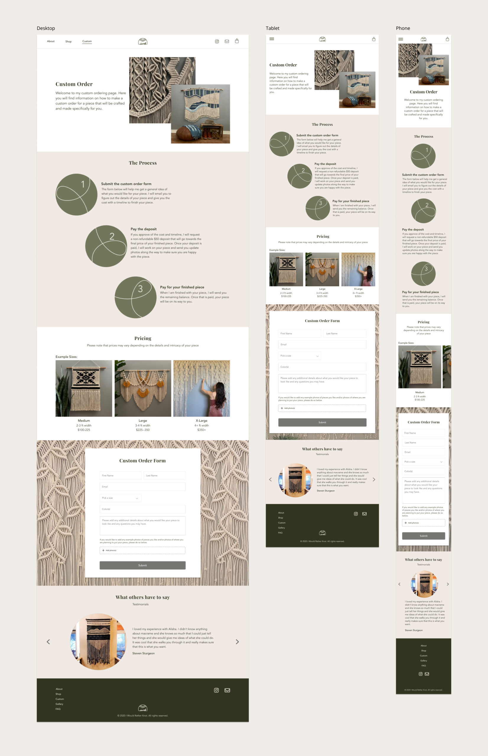
High-Fidelity Responsive UI: Custom Page
Working off of the UI kit, the wireframes and the information/feedback from the research, responsive UI designs were created.
4. Test
High-Fidelity Prototype
A high-fidelity prototype was created to test the process of a user purchasing a pair of earrings and making a custom order requested.
Task Usability Testing
6 participants tested the usability of the site to:
- Determine the level of intuitiveness of the design’s navigation and flow as a whole
- Find out how intuitive the custom order page is and how it can be improved
- Find out how intuitive it is to shop for one of I Would Rather Knot’s recurring items
- Identify any problem areas, confusion or difficulty of the design
The test was conducted over Google Meet, where each participant shared their screen, so that I could observe them while they complete each task.
Participants were given 3 tasks to complete
- Find more information on I Would Rather Knot and how it got started
- Buy earrings for a friend
- Make a custom order
Task Usability Outcomes
- 100% of the participants were able to complete the tasks
- Users like that the design was simple and clean
- All participants felt that the navigation was easy to understand
- 3 out of the 6 participants did not know clicking the logo navigates back to the homepage
Next Steps
- Adding a home button to the websites navigation in addition to having the logo navigate back to the homepage. This will allow those who who do not know the logo navigates back to the homepage a way back home.
- Creating the website using WordPress with the help of a developer
- Handing the website to the business owner
Conclusion
Working for this small business that is taking a big step in moving their business online and being a part of the process was quite rewarding. I learned a lot through this project. It was a great experience to work with the business owner and to talk with her real customers who this website will impact directly. I learned that working with both the stakeholder (business owner) and users (customers) are an integral part of the design process. Having talked with both sides enabled me to design for both parties. I not only had to design for the wants of the customers, but also the capabilities of the business owner.
In Progress: Building the Website on WordPress
I spent some time researching the best way to create the website that would enable me to hand the site off to the business owner when it is completed. I ended up using plugins (Elementor and Woocommerce) to build the site with the help of a developer to customize elements from my design.
The I Would Rather Knot website is currently in the development process and will be up soon.
