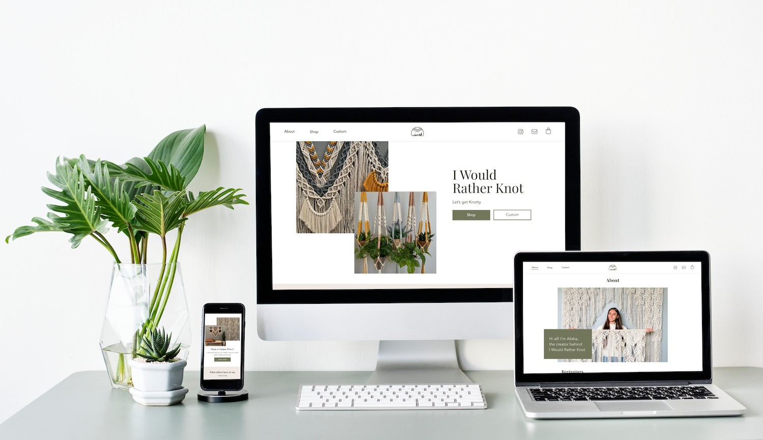
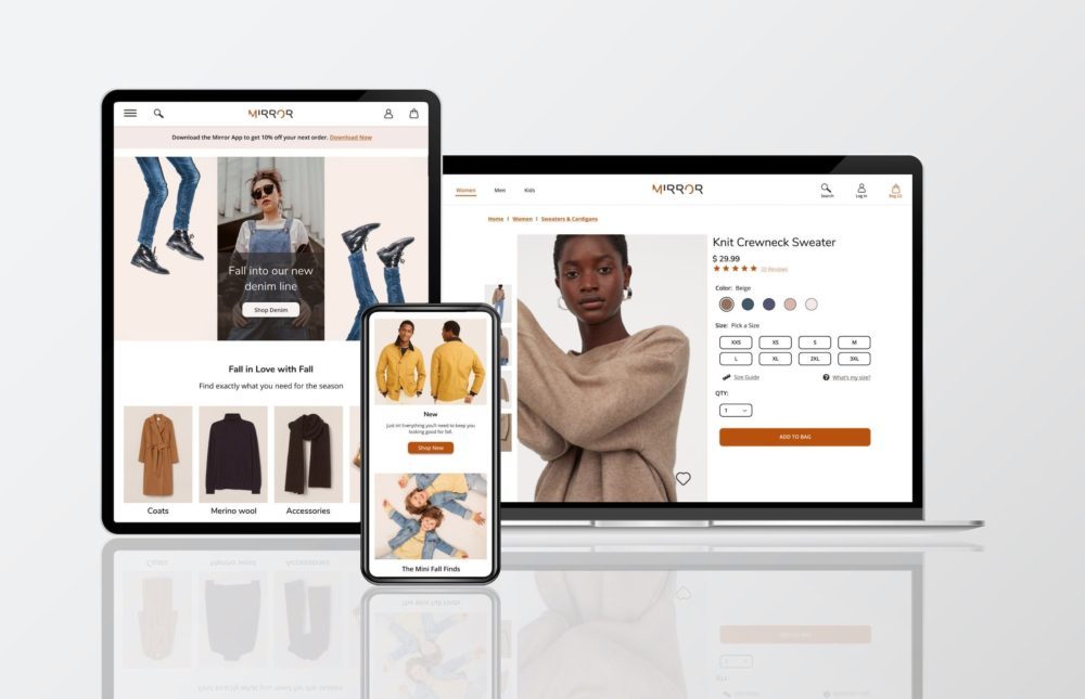
Mirror
Designing and branding for a responsive e-commerce website as part of my work at DesignLab
Overview
Mirror is a fictitious successful brick and mortar clothing store, with over 400 stores around the world in 32 countries that does not have an e-commerce website. Mirror customers have been requesting e-commerce for years and the company wants to take advantage of the opportunity their sales through an e-commerce platform.
Role
UX/UI Designer and Branding
Project Objective
- To create a new logo and branding materials for Mirror’s new e-commerce presence
- To create a responsive e-commerce website to sell Mirror’s products online
Process
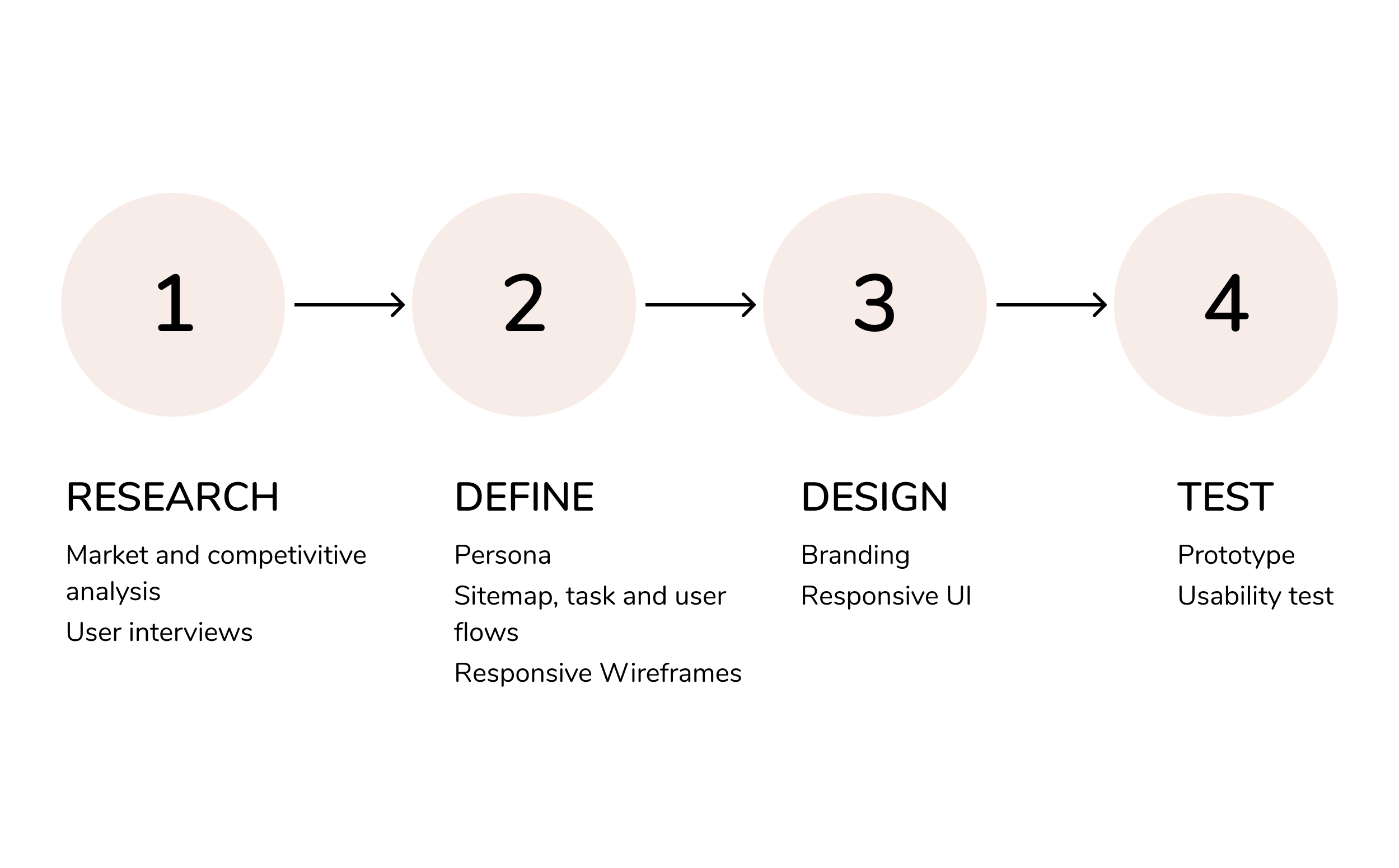
1. Research
Market and Competitive analysis
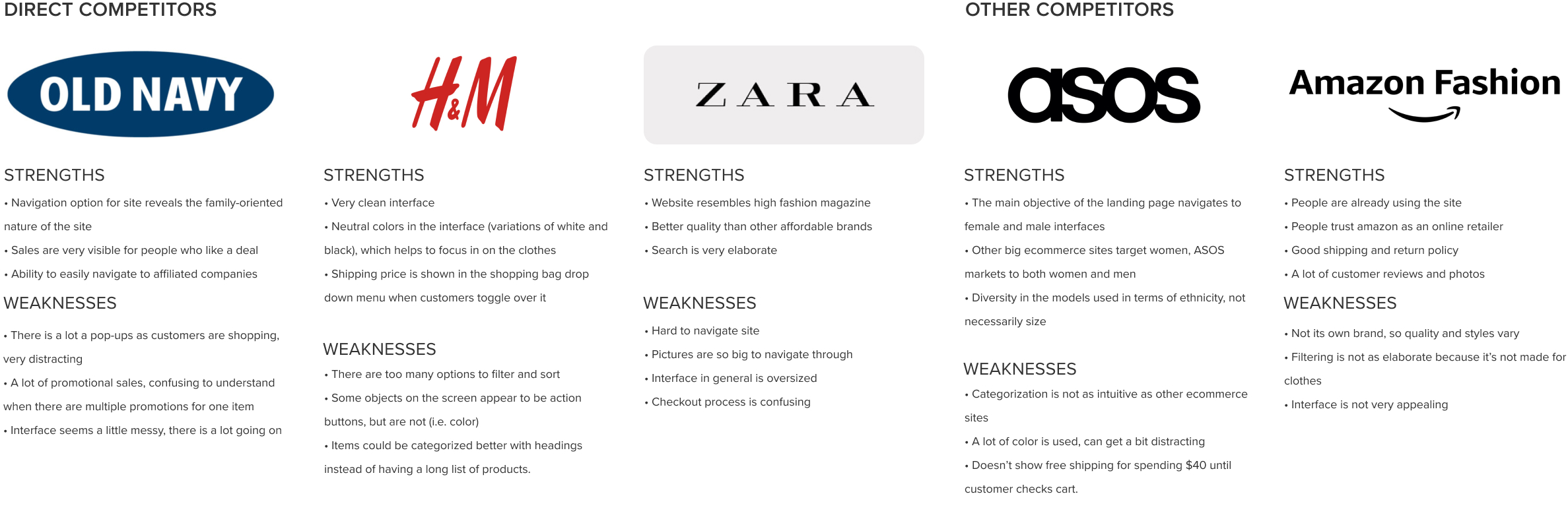
Competitive Analysis
It was crucial to understand the current e-commerce industry since it is a relatively established market. Understanding the current trends and best practices of the industry helped to build a comprehensive site from a solid foundation.
User Interviews
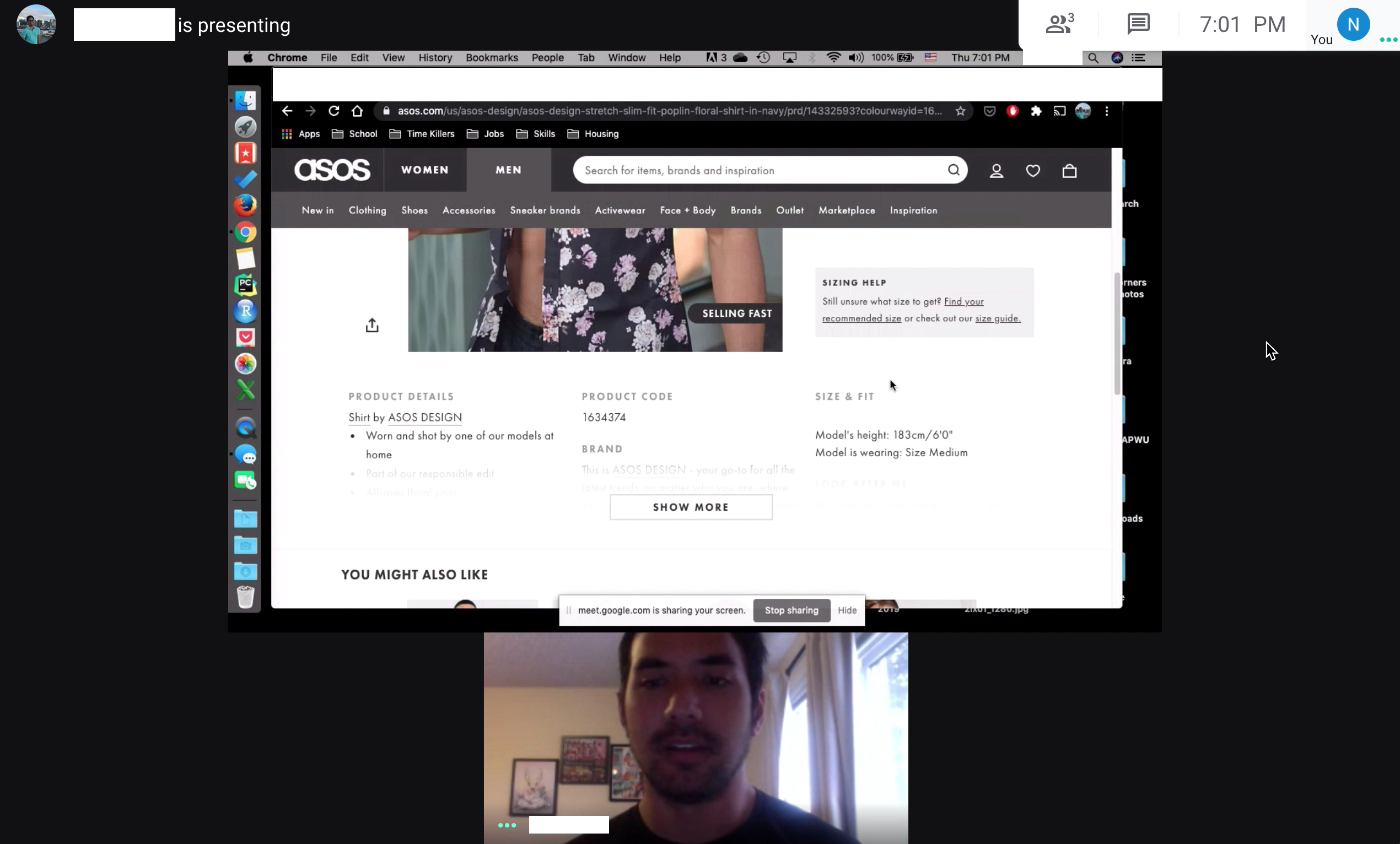
User Test over Google Meet
I chose to conduct a contextual inquiry with five participants ranging from ages 30–65 to view their habits when they shop for clothes online. I facilitated the interviews over Google Meet. The interview started by asking some preliminary questions about their online shopping experience. Then, each participant screen shared with me their process of how they would purchase two affordable tops online on the site of their choice. I let them go through the process and observed.
Research Outcomes
- Overall it was important for users to have a website with easy navigation
- There was a better experience the less clicks a customer had to perform
- Multiple pop-ups and a lot of color was distracting and an annoyance
- Reviews help to push users towards making their purchase
2. Define
Persona
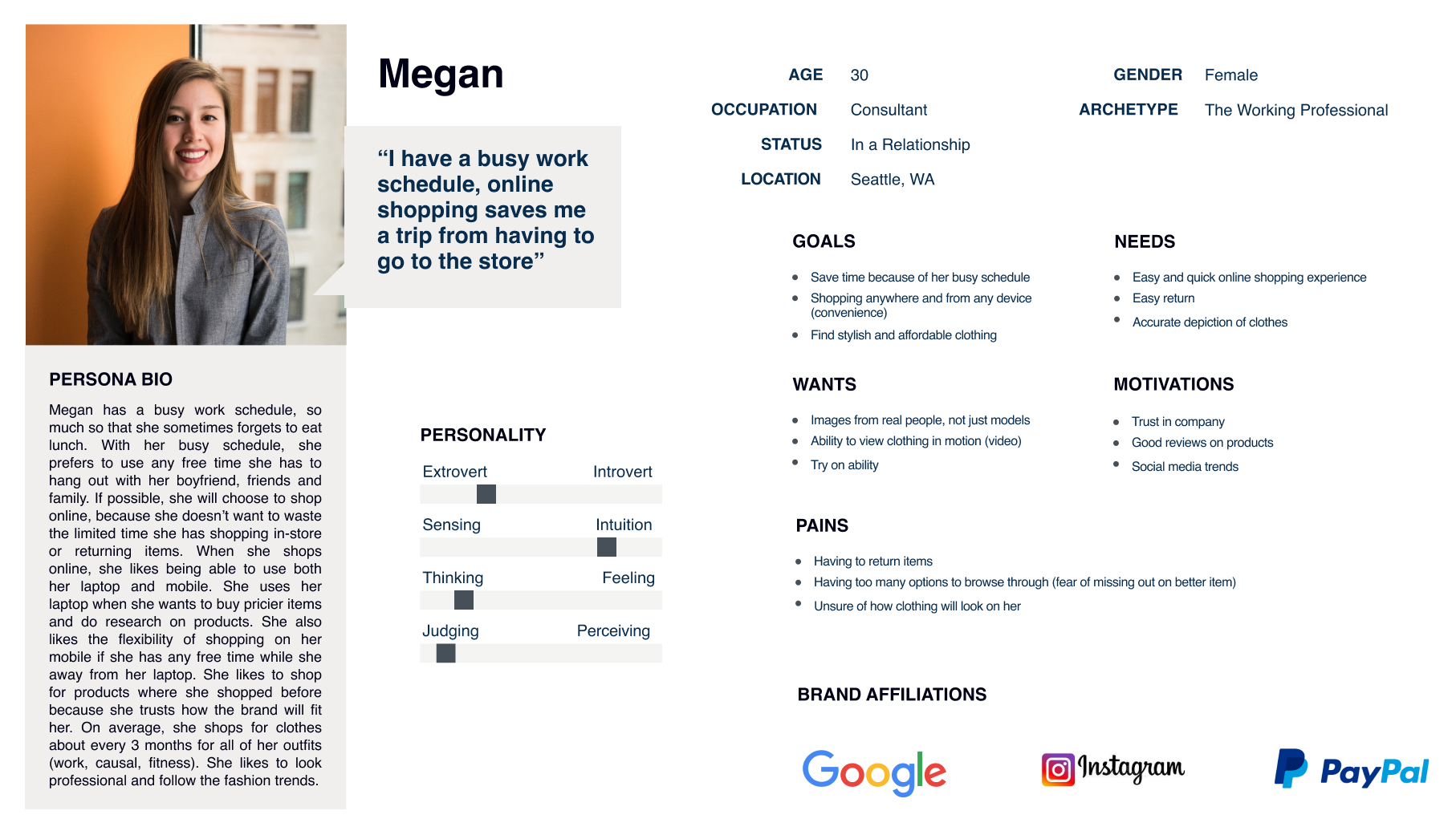
Mirror Persona
A persona was created taking into account the different behaviors, values and concerns the interviewees had. The persona impacted the design decisions and help to focus on the needs of the users. It helped me to empathize with the users as I developed the product.
Sitemap, Task and User Flows

User Flow
A sitemap was created in order to map out the structure of the site. The task and user flows were made to help examine the sitemap to see if there were any areas to simplify or reveal any gaps the sitemap may have had.
Responsive Wireframes
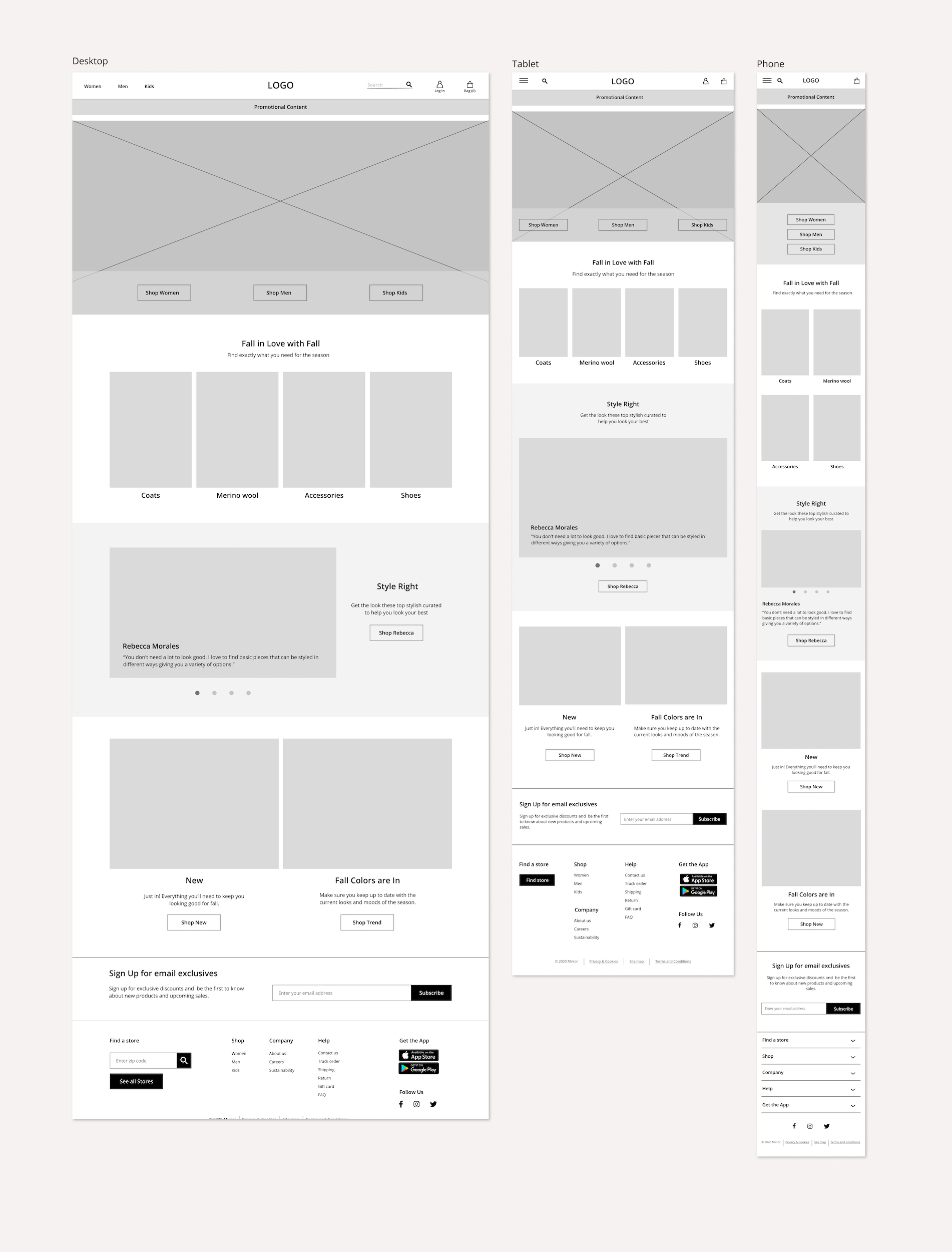
Responsive Wireframes of the Homepage
Building the responsive wireframes, I was able to get an overall picture of how I was going to layout the site. Also, taking into account my research, persona, sitemap and flows in my design.
3. Design
Branding Material
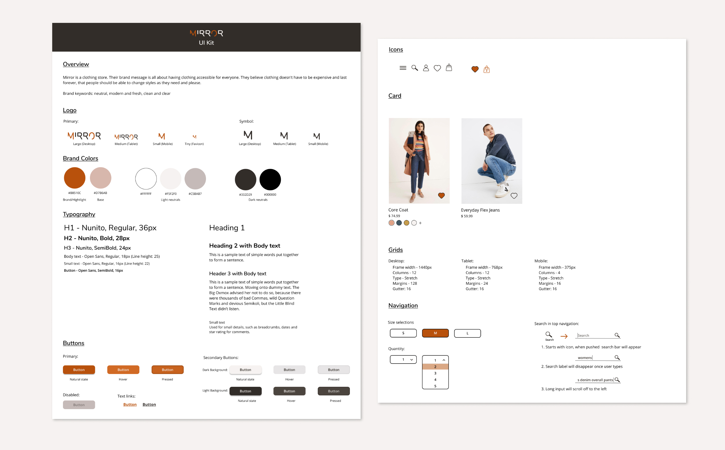
UI Kit
With the branding key words of Mirror’s brief in mind the design was kept neutral modern and fresh, clean and clear.
Logo: There was multiple iterations. I ended up using one that gave a modern and fresh feel that would resize well on different devices.
Typography: Nunito and Open Sans were the fonts chosen to give a nice sleek and clean look to the site.
Colors: Because Mirror is an e-commerce clothing store, neutral colors were chosen to allow the colors from the various clothing and accessories to naturally pop out.
UI elements: outline the functionality of the buttons and search function.
High-Fidelity Responsive UI
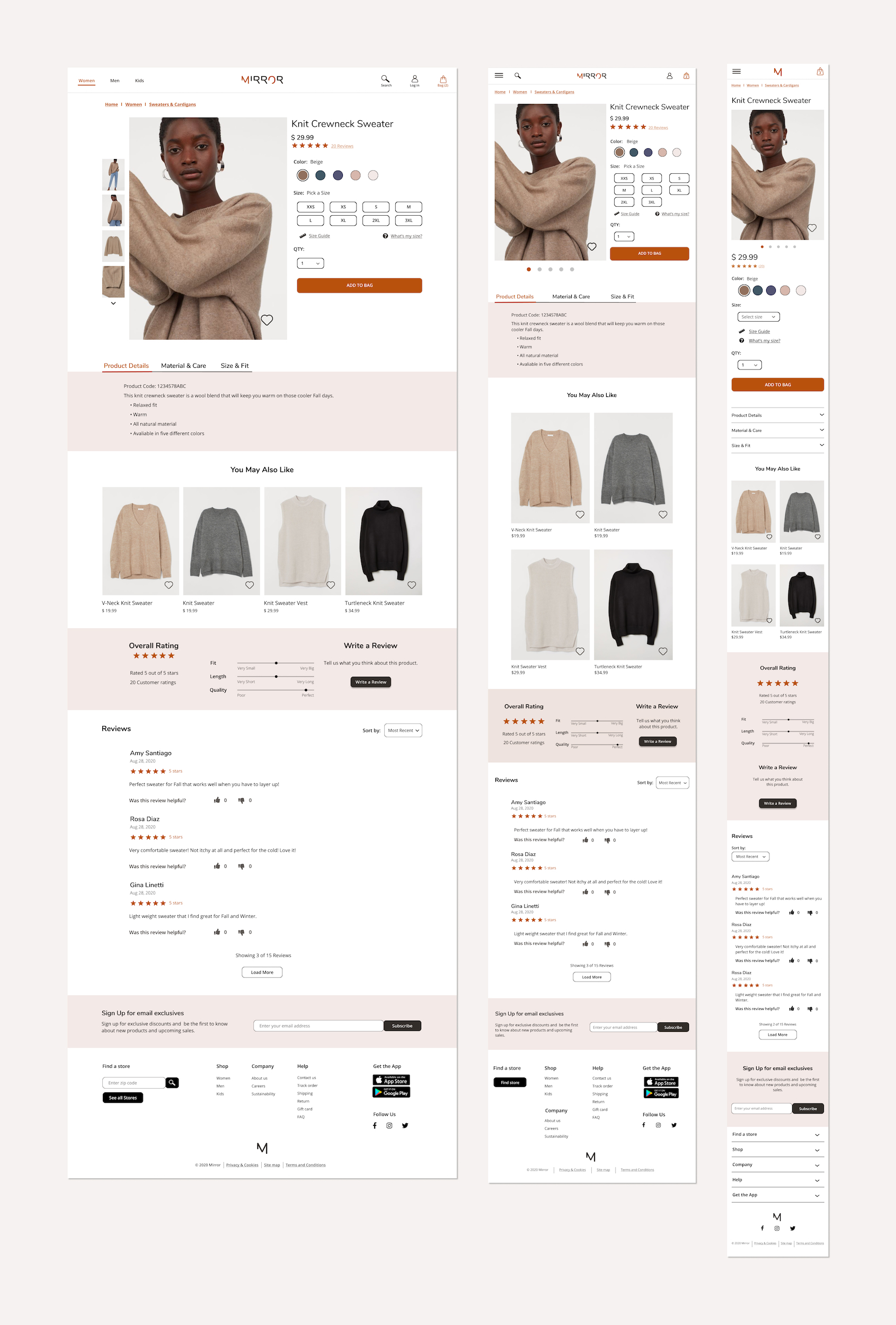
High-Fidelity Responsive UI: Product Page
Working off of the UI kit, the wireframes and the information/feedback from the user research, responsive UI designs were created.
In the research phase, I found that user’s prioritized reviews and size charts because a major pain point for customers was having to return products. Thus, reviews and transparency with sizing and fit from other customers proved to be important when customers shop. To carry over sizing concerns into the design, I made sure to add an overall sizing section. Then the designs were carried over to responsive sizes for other devices.
4. Test
High-Fidelity Prototype
A high-fidelity prototype was created to test the process of a user purchasing a sweater from the Mirror site.
Task Usability Testing

Task Usability Test over Google Meet
4 participants tested the usability of the site to:
- Determine the level of intuitiveness of the design’s navigation and flow
- Find out how a user would search for a specific item
- Find out how long it takes for a user to complete a task
- Identify any problem areas, confusion or difficulty of the design
The test was conducted over Google Meet, where each participant shared their screen as they completed tasks as I observed.
Participants were given 4 tasks to complete:
- Find the sweater options
- Find the product page for a beige sweater
- Find the reviews
- Add the sweater to bag and proceed to checkout
Task Usability Outcomes
- 100% of the participants were able to complete the tasks
- Participants were able to complete each task fairly quickly
- All felt that the navigation was pretty easy
- Most participants choose to “close bag,” rather than “continue to checkout,” when given the option via the bag pop-up
Next Steps
Had there been more time to work on the Mirror project I would have liked to expand on the prototype. Creating a more extensive prototype would have ensured the overall usability of the website and revealed any areas for improvement.
It would also be beneficial to further test the pop-up function of the bag when customers add an item (see image below). It seemed like more of a nuisance than helpful. Several participants expressed they like to put all of their items in the bag and review it at the end of their process.
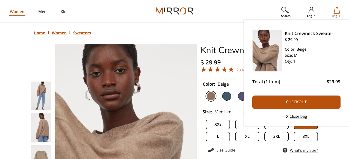
Bag Pop-up
Conclusion
I learned a lot about the user experience process. It was informative to see all that goes into creating a successful product. I found talking with users to be the most important part of the process that helped me to focus on them as I designed. Even though the e-commerce industry is quite established there is so much to learn from the people who use these products